- The Trial of the Timelord
 This artwork was used for the outer cardboard box which contained the 3 tapes which made up the 14 episode 23rd season. Despite being constructed in a manner based loosely on Charles Dickens’ ‘A Christmas Carol’ those three story strands are each represented in the artwork, by Drathro, Sil and a Vervoid. In addition the over-arching plot concerning the trial of the Doctor is also represented with the inclusion of the Valeyard. It is the image of the Valeyard which gets the cover on this list. The detail and visualisation of the three alien creatures is excellent but it is the way that Michael Jayston’s eyes appear to be piercing from the surface, staring out at the viewer which makes this design notable. It also features a very strong image of Colin Baker, resolute and focused, indicating the severity of the predicament in which he finds himself in during the story.
- The Power of Kroll (Colin Howard)
 Although this story is not highly regarded the VHS cover designed by Colin Howard is excellent. Kroll looks imposing, dominating the frame and towering over the Doctor and Ranquin in a far more convincing manner than is achieved during the story. It is also one of few artworks where the artist manages to portray the environment in which the story takes place. In this case the long grass, rising to above Tom Baker’s waste, and the watery swamp give you a feel for the story without knowing any of the plot. It is also always appreciated when we get images of the lovely Mary Tamm, in her penultimate story on Doctor Who, this time looking over the Doctor.
- Paradise Towers (Colin Howard)
 Again, not a widely regarded story but once more Colin Howard manages to deliver an impressive piece of cover artwork. What makes this piece so succesful is the image of the Doctor and Mel, wrestling with the pool cleaner robot. The expressions and grimaces are incredibly accurate, you can practically hear Bonnie Langford screaming. Similarly the Chief Caretaker, the wonderful and much missed Richard Briers is also beautifully included. Other notable details such as the deterioration on the tower blocks and the water also add to the overall appeal of the cover. The shape of the cover is also broken up with a curve outline, something not seen on other artwork.
- Planet of Fire
 This is the only video cover which was released after 1996 to make this list. After the Paul McGann TV movie was broadcast the BBC decided to change the style in which video covers were made. Instead of commissioning artists to create a unique piece of artwork, digital photomontages were used instead. The majority of these are largely uninspiring and insipid with very little flair. However, this example for Planet of Fire does get onto the list. The strength of it lies in the realistic effect of the flames engulfing the leading characters. Although it is not particularly representative of the product of the story but it certainly matches the title.
- The Mark of the Rani (Colin Howard)
 This cover equally features all three of the lead actors from the story, including in her first appearance The Rani, played by the effervescent Kate O’Mara. Anthony Ainley also makes the cover along with Colin Baker. One of the strongest features of the artwork is the background, the green star field permeating across the cover. Although hidden by text we also see the Rani’s Tardis console. This was a fantastic design featured in the story, which sadly did not return. Instead of the hexagonal shaped console we’d seen since 1963 this console was circular, with a central time rotor constructed of conjoined hoops. Other features also include Stephenson’s Rocket, which doesn’t feature as predominately as the mine shaft that is used for the cliff-hanger of Part 1. Colin Baker’s Doctor features centrally in the composition.
- The Day of the Daleks
 This is one of the earliest video releases, only the 7th title, from 1986 and as a result it has a simple photo montage cover design. Although simple, featuring only Daleks in a strong ‘V’ formation it actually suggests a story featuring lots of the evil pepperpots from Skaro. However, this is something which ultimately the story doesn’t deliver. The artwork features five Daleks, but the story only sees three make an appearance but this shouldn’t be looked on as a negative. Video artworks for Dalek stories often mean them sharing the limelight with their Time Lord nemesis or the Exillons or Davros, a trait which continued into the DVD range. But on this occasion the cover is all about the Daleks, they fill the frame, menacing in their formation. As the most successful alien creation on the show it is only right that they take centre stage for once.
- The Deadly Assasin (Andrew Skilleter)
 This is Andrew Skilleter’s first entry onto the list, an individual synonmous with Doctor Who artwork. He produced covers for the Target and Virgin novels, plus the iconic Five Doctors Radio Times cover. This particular example for the Deadly Assasin is very strong. Tom Baker is the central focus and his facial features are captured perfectly. Equally well realised is the decomposing Master, his creepy elongated fingers stretching over the Doctor. The shadowed figure of Goth also replicates a strong image seen during the story, as is the triangular sights. Also included is the seal of Rassilon design which is subtle with Tom Baker taking the central focus with the threatening Master looming over him.
- The Mind Robber (Alister Pearson)
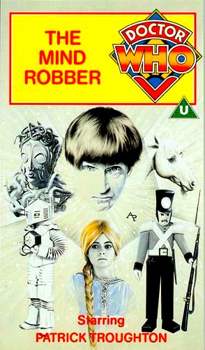 Stories of Doctor Who from the 1960’s were produced in black and white and the video covers refected this. However, there was the possibility to include some colour and in this case the colour was included in the realisation of Rapunzel. The golden hair brings life to the artwork but that does not mean that the rest of it is lacking in any way other than colour. The Mind Robber is a story with a lot of different elements and the majority of those are reflected in this cover. The white robots and Medusa are incredibly detailed and the addition of the clockwork robots and unicorn add more strong visual elements. Also of note is image of Patrick Troughton, with his hair taking a lot of the plaudits which always reflected his ‘cosmic hobo’ characterisation of the role.
- Warriors of the Deep (Colin Howard)
 Although not a highly regarded story Warriors of the Deep did see the returns of both the Silurians and their sea dwelling cousins. The colour of the artwork, a deep green, reflects the deep ocean floor where the story takes place, specifically the sea base, located appropriately at the bottom of the composition. Whether you agree with the redesigns of the two main monsters or not one has to admit they do look impressive on this cover with exquisite detail. Even the Myrka looks intriguing, a creature which failed to deliver on screen but seen in an appropriately selective way. The Silurian ship adds balance to the composition with the Doctor taking centre position. However, the image of Peter Davison is clearly taken from a still taken during the production and doesn’t work effectively on the cover, his eyes looking in the general direction of the Sea Devil but not specifically at him.
- The Ark in Space
 This is a brilliant cover. Simple in it’s construction but incredibly effective. Realeased in 1989 it demonstrates how the compositions improved gradually over time from the Day of the Daleks release with more elements being added and the overall composition improving. This cover includes a great image of Tom Baker, looking delightfully apprehensive and also has the space station Nerva, orbiting the planet Earth. However, the absolute success of this cover is the Wirrin. An alien creature, brilliantly depicted, lurching and threating over the whole planet. It is a very evocative image and works beautifully. The text at the bottom is also placed properly, all other releases having in centrally which often obscures parts of the design. That method could actually have worked on this cover but the fact it is moved over to the bottom right corner balances the whole image very succesfully.
- Terror of the Autons (Alister Pearson)
 This is a great cover which would’ve caught the eye of any shopper at their local video store. Largely this is because of the rich purple background which doesn’t correlate to anything seen in the story but works perfectly with the rest of the configuration. Both Jon Pertwee’s Doctor and Roger Delgado’s Master are perfectly brought to life, Pertwee’s hair and Delgado’s goatee beard in particular look fantastic. The Autons also get a respectable presence with the faceless Auton policeman looking menacing and the oversized carnival mask equally prominent. The centre image of the radio telescope signalling to the Nestenes is an interesting selection but does provide an adequate focal point to the composition.
- An Unearthly Child (Alister Pearson)
 This cover is one of a few which featured both on the VHS release but also as the cover to the Target novelisation. As discussed previously, it was an executive decision that the covers for 1960’s Doctor Who stories must reflect the black and white nature of the video material. As a result the design was largely monochrome but still has fantastic creativity. The blending of William Hartnell and Carol Ann Ford’s faces is beautifully executed and rightly receives the focus. Hartnell in particular is beautifully captured. The bottom of the frame recreates an iconic moment from the closing seconds of the very first episode, the TARDIS landing on the unknown landscape. This is picked up brilliantly with the TARDIS itself being in colour, the prominent blue standing out from the rest of the composition despite the fact it would obviously have been monochrome on the video.
- Castrovalva (Andrew Skilleter)
 This is a fantastic piece of artwork which just so happened to be used as a video cover. The incredible highlight is the visualisation of the recursive occlusion seen during the story. Such an abstract image must have been incredibly difficult to achieve but is pulled off spectacularly with the Fifth Doctor moving through the myriad of staircases. The image of Peter Davison in his first televised appearance as the Doctor is suitably prominent, even if his hair doesn’t seem as blonde as in real life. Anthony Ainley’s Master also gets an appearance, firing his TCE weapon and his TARDIS also stands at the top left corner of the composition. The colour is also very strong and rich but ultimately the quality of the artwork is in the abstract recursive occlusion visual.
- Tomb of the Cybermen (Alister Pearson)
 Missing, presumed dead! Returned to BBC Video after over 20 years.
Need I say more?
When Tomb of the Cybermen was discovered in Hong Kong in 1991 it was a moment of celebration for Doctor Who fans. At the Doctor Who celebration at Longleat in 1983 a poll was taken for the first title which fans would like to see released onto video. Tombs won. But because it wasn’t in the archive any longer Revenge of the Cybermen was released instead. However, in 1992 fans could finally own the Tomb of the Cybermen and watch it as often as they liked. The artwork for the release appropriately features the iconic image of the story, the Cybermen breaking out of their tombs.
- The Sea Devils (Colin Howard)
 This is my all-time favourite Doctor Who video cover. It features one of the most iconic images of Jon Pertwee’s Doctor, a photograph taken during the making of this story with a Sea Devil reaching for his shoulder, which incidentally I have framed and on my wall at home, much is my fondness for it. Pertwee’s facial features and expression are captured perfectly. Similarly, the legendary Master, Roger Delgado features in the artwork and is visualised expertly, holding his calling device which adds another detail, as does the prison castle. The real highlight however is undoubtedly the Sea Devils. It is not very often that we were treated to multiple versions of the same monster on a cover. But in this case we have a trio of Sea Devils, all from different angles providing a more rounded view of these iconic monsters. The background is an appropriate blue colour; highlighting the nautical nature of the adventure but for some reason the DVD release had a pink colour scheme.
Overall, it is one of the best examples of the amazing artwork created by a series of talented artists for the popular VHS releases, showcasing fantastically captured Doctors, villains and monsters in beautiful compositions that will live long in the memory.
 Louis Marx & Co. released some of the earliest Dalek toys in 1965, and used a friction drive movement. Later radio controlled variants were famously used in the climatic model sequences used for the 1967 episode ‘The Evil of the Daleks’ to depict the explosive Dalek civil war. Marx also released one of the most popular Dalek toys of the 1960’s which were the ‘Rolykins’. Costing 1 shilling they had the unique feature of a ball bearing in the base which allowed it to glide effortlessly across a table or flat surface. At approximately 1 inch tall, with detachable eye stalk, plunger and weapon, they sold in vast quantities and their popularity triggered a replica re-release by Product Enterprises in 2000.
 The highlight of Dalek merchandise during the 1960’s was the child’s playsuit. The first version was made by Scorpion Automotives in 1964 costing £8, 15/6 and is now incredibly rare due to a fire at the factory which destroyed stock and components needed for the manufacturing process. William Hartnell’s granddaughter received one of these Dalek playsuit for Christmas from the Doctor himself! Due to their limited number a Dalek playsuit of this type, complete with box, is worth thousands of pounds today. In contrast, the Berwick playsuit, released a year later, is less rare with more units known to have been sold at an expensive 66/6. Both versions consisted of a Dalek headpiece, constructed of a combination of cardboard and plastic, and PVC plastic which covered the rest of the child whilst they poked the plunger and weapon out of two holes.
 The first Doctor Who novel published in 1964 of course featured the Daleks and was a novelisation of the original Dalek story. Titled ‘Doctor Who in an exciting adventure with the Daleks’ it was published by Frederick Muller Ltd and was also followed by ‘Doctor Who and the Zarbi’ and ‘Doctor Who and the Crusaders’. Other books published around this period included ‘The Dalek Book’ (1964), the first ever piece of Doctor Who merchandise released, and ‘The Dalek World’ (1965). Both of these books were written by Doctor Who’s script editor David Whitaker and Dalek creator Terry Nation, accompanied by vivid artwork that featured Dalek’s with numbers on the dome because of a photograph given to the artist taken during studio rehearsals when Dalek props were labelled for the benefit of the director to give instruction. Dalek adventures could also be followed in the TV Century 21 comic strips from 1965-1967, none of which featured the Doctor and his companions. A traditional book which is still published today is the yearly ‘Doctor Who Annual’, the first of which appeared in 1965 and had William Hartnell on the cover.
 The first factual book concerning the production of Doctor Who was released in 1972 titled ‘The Making of Doctor Who’, revealing how ‘The Sea Devils’ was created from script-to-screen. This book allowed readers to discover the technical and practical aspects of television production; Russell T Davies, for example, stated that it first made him aware of script editors, producers and directors influencing his eventual career path. Factual books still form a role within Doctor Who merchandise to this day, be it a guide to the monsters and companions that have appeared in the series, encyclopaedic reference books and published scripts.
 In 1971 Jon Pertwee appeared on boxes of Kellogs’ Sugar Smacks promoting ‘The Timeless Energy of Dr. Who’ and inside the box would be one of six collectable badges. During the 1970’s breakfast cereal ‘Weetabix’, also ran two different promotions. The first, launched in 1975, saw promotional boxes containing stand-up figures using accurate artwork including the Doctor, Sarah Jane Smith and various monsters, with 24 to collect in total. In addition to the figures, the cereal boxes included one of six background settings. The second promotion ran from March to May 1977 and this time artwork cards were collected to be used as playing pieces on a board game included on the back of the box.
 Doctor Who Weekly/Monthly/Magazine
 BBC Video and DVD
 Towards the end of 1999 the first Doctor Who DVD, ‘The Five Doctors’ was released. However this release, with other titles including ‘The Black Adder’ and ‘The Planets’ was an exercise conducted by BBC Worldwide to test the DVD market which was still developing. It wasn’t until a year later, when the DVD range began properly, a new medium for a new millennium, with the release of ‘The Robots of Death’. Distributor 2 entertain, now owned by BBC Worldwide, released Doctor Who DVDs from 2004-2012 and they were instrumental in commissioning new material for their releases. As a result the ‘Classic’ DVD range has provided us with new interviews with cast members and crew, episodes with improved CGI effects and an insightful record of how television production methods have changed since the 1960’s. Other notable documentaries have chronicled the programme’s beginnings, the most turbulent and controversial periods and even the special relationship it has enjoyed with another BBC icon ‘Blue Peter’. The DVDs regularly include picture galleries, audio commentaries and informative subtitles and, through collaboration with the Restoration Team, improved picture and sound quality. Some classic stories have even been reimagined for their DVD release, for instance Fiona Cumming was able to revisit ‘Enlightenment’, some 25 years after directing it for broadcast. There have also been some exciting additions to the Doctor Who catalogue which have never previously been released. As well as newly discovered episodes, such as ‘The Enemy of the World’ and ‘Galaxy 4, episode 3’, viewers have also been treated to animated versions of other missing episodes. Stories such as ‘The Reign of Terror’, ‘The Moonbase’, ‘The Ice Warriors’ and ‘The Invasion’ can now be viewed in a complete narrative of episodes. Even William Hartnell’s swansong ‘The Tenth Planet, episode 4’ can now be viewed in animated form.
 Dapol
Dapol After the series was quietly cancelled Virgin Publishing were given a license by the BBC to produce new adventures which continued the adventures of the 7th Doctor and his companion Ace. From 1991 to 1997, 61 novels were published; authors included former script editors Terrance Dicks and Andrew Cartmel but future contributors to the show such as Russell T Davies, Mark Gatiss and Gareth Roberts. Intended for a mature audience the range approached more adult themes. One highlight was the publication of ‘Lungbarrow’, a story idea intended for television which saw the 7th Doctor return to Gallifrey and revealed mysteries previously alluded to in other televised episodes. However, one novel which did make it to television screens was ‘Human Nature’. Written by Paul Cornell, it struck a chord with Russell T Davies in particular, and in 2007 an adaptation of the story was broadcast starring David Tennant’s 10th Doctor.
 Big Finish